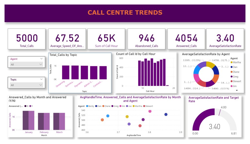
Result
Key Metrics & Insights:
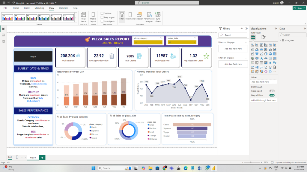
 Total Orders – Measures overall pizza sales performance. Average Sales per Order – Calculates revenue per transaction to understand customer spending habits. Best-Selling Product – Identifies the most popular pizza based on sales volume and revenue. Average Order Value (AOV) – Analyzes the typical order size to track sales trends. Sales by Category & Size – Breaks down revenue based on pizza type (e.g., Veg, Non-Veg) and size (Small, Medium, Large). Busiest Days & Time of Year – Determines peak demand periods to optimize staffing and inventory.
Technologies Used:
 Power BI, DAX, Data Cleaning, Data Visualization, SQL SERVER, EXCEL
Business Impact:
 The dashboard helps in identifying top-performing products, optimizing promotions for peak hours, and improving inventory planning based on busiest days and seasons.